Whaleportal Heatmaps: How to Read the Market in Real Time
What are heatmaps?
You might have heard about heatmaps before in Bitcoin and crypto trading. Heatmaps are visual representations of specific data on the chart. The visual representation makes it very easy to read specific data for traders and analysts. The data is represented as colours and the intensity of the color increases or decreases depending on the data, that’s why it’s called a “heatmap”.
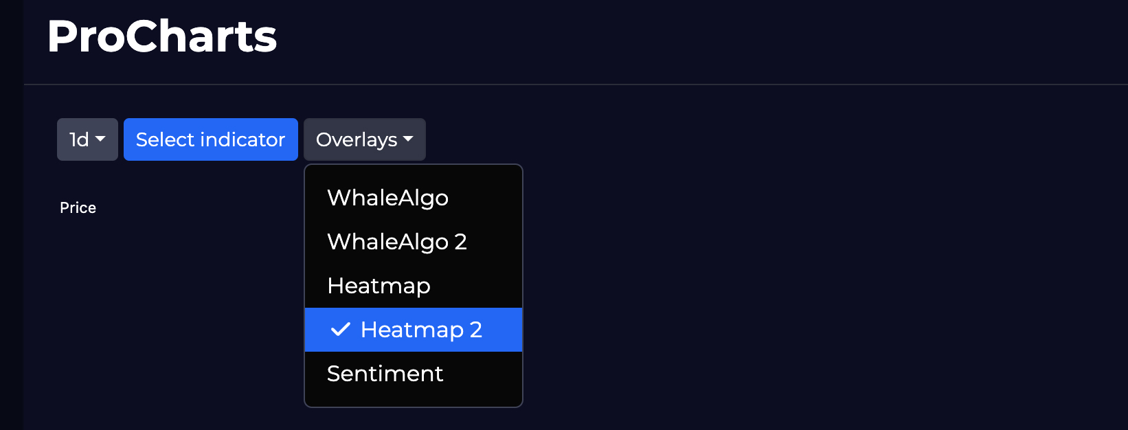
How to add heatmaps to your chart
Go to “Pro-charts” and click on overlays, there you can select between heatmap and heatmap 2.
They both are very similar one the equation is slightly different.
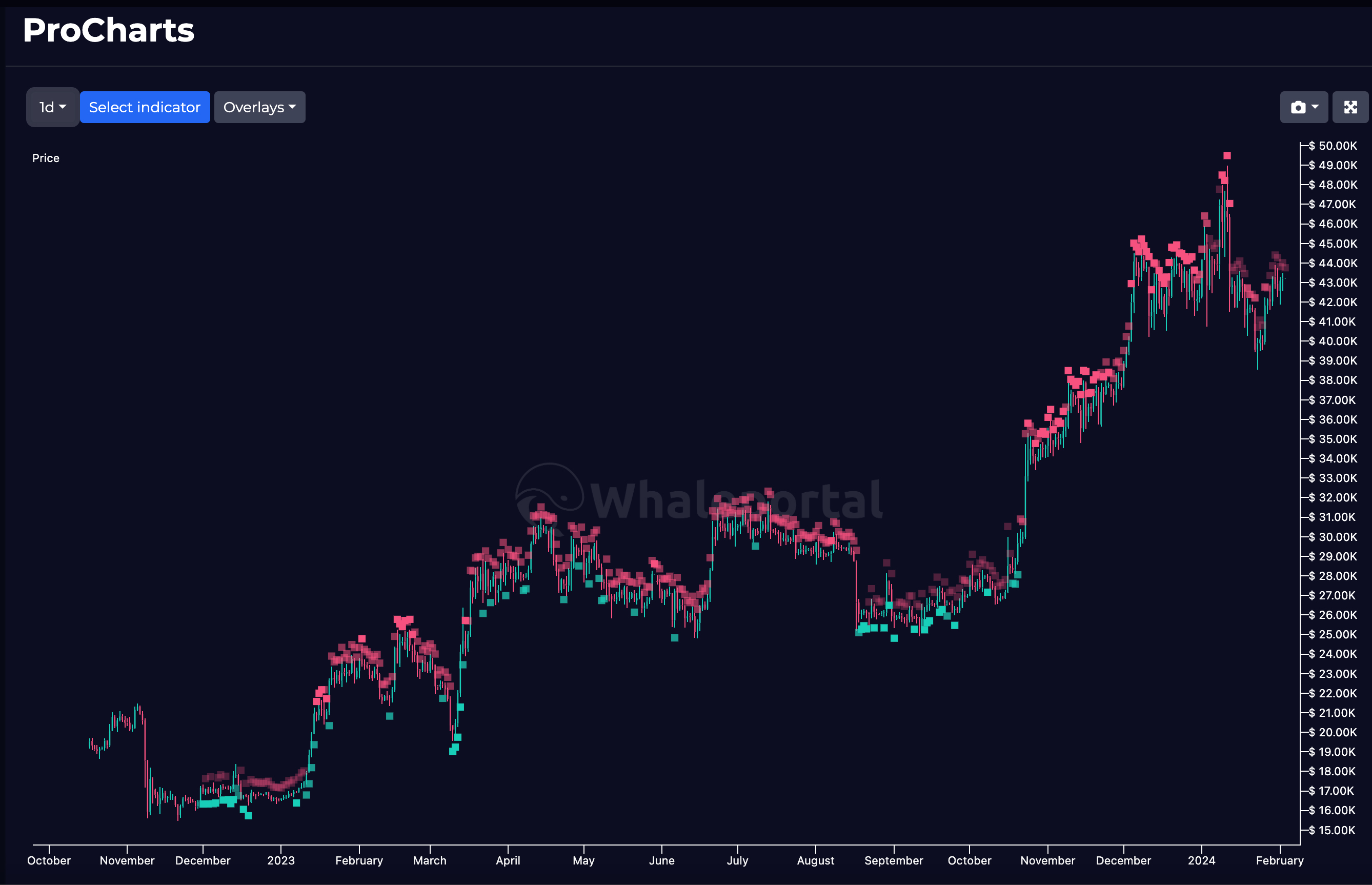
Whaleportal Heatmaps
We have created a very unique heatmap that is showing whether there is more selling or buying pressure present in the markets. We use different data metrics to calculate the intensity of the color. Simply said, when there is an increasing red intensity the selling pressure increases and the chances of a price direction to the downside increases. This is shown as red blocks above the candle. When the colour is green, the block will be below the candle and this tell us there is more buying pressure accumulating and that increases the likelihood of a price move to the upside.
How to read these Heatmaps?
It’s not 100% that simple that when there is red, price goes down en when there is green price goes up, although the heatmap can be extremely accurate. You have to take market conditions in consideration too.
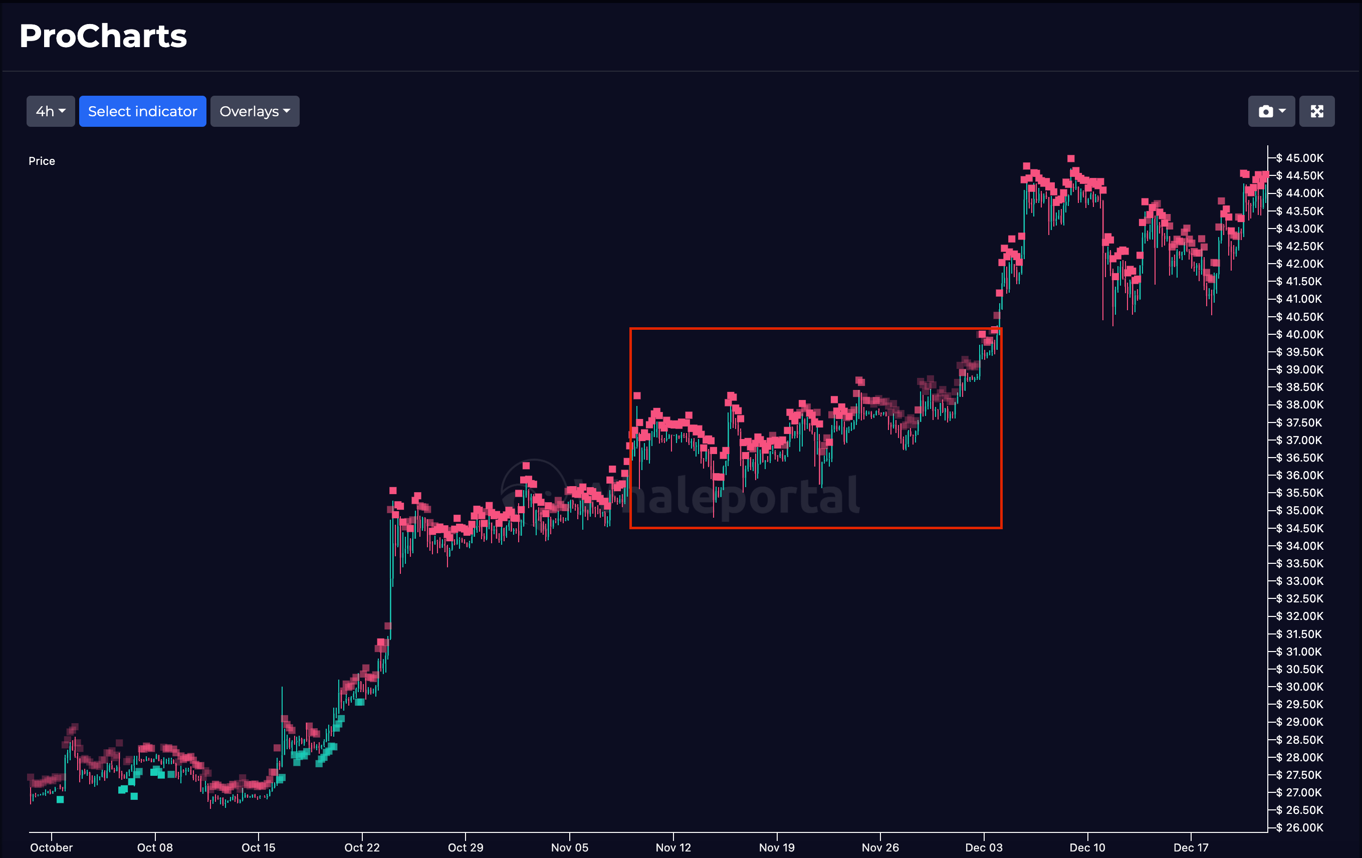
Sometimes, when Bitcoin is in a strong uptrend, even with red boxes above the candle, indicating selling pressure the price can still go up. However, it most of the times will only go up when the intensity decreases. So that means that the selling pressure decreases and therefore creating more space for potential upside.
In the example above you can see how this works exactly. Bitcoin is in a very strong uptrend and right before the next breakout you see the intensity of the red boxes decreasing, indicating that the selling pressure decreases, to almost neutral, this gives Bitcoin room to continue and finish the rally. So in a bull market, with low selling pressure price can go up, that means in a bear market, with low buying pressure the price can decline due to the macro situation. This is also an extra advantage of this indicator as it will be easier to spot bull and bear-markets.
Combine heatmaps with different indicators
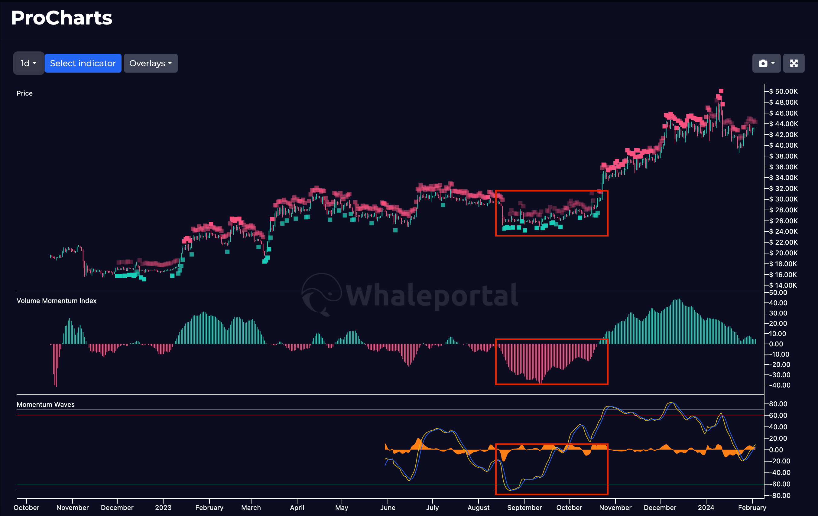
We offer many more indicators at Whaleportal Pro Charts and the power of analysis is in the combination of multiple metrics. The heatmaps are mainly based on live derivative exchange data, while other indicators can be based on sentiment or price structure. When you combine multiple indicators you perspective on the market may become more accurate.
In the image above you can see for example, a period where buying pressure is prevalent and accumulating, while the momentum index is going up together with the Momentum waves. These indicators are strengthen each other and give a better perspective on the markets as they compliment each other.