Liquidation heatmap explained - How to use Bitcoin liquidation heatmaps (COMPLETE GUIDE)
If you trade cryptocurrencies, you have probably seen the famous liquidation heat map, showing where large clusters of liquidations sit. You may wonder, why is this important as a trader? Well, these liquidation heatmaps can really help in making price predictions on Bitcoin. Let’s dive into the mechanics of these liquidation heat maps and look at why they present such valuable information.
Key Takeaways
-
Liquidation heatmaps show where most traders will be liquidated.
-
Yellow = high liquidation zones, Blue = low liquidity.
-
Price often gravitates to yellow zones ("magnet effect").
-
These zones help predict support/resistance and price direction.
What are Liquidation heatmaps?
Short answer: it forecasts the price levels where significant liquidation events are likely to happen.
However, there are many aspects about these charts that can be discovered and understood. Let’s dive a bit deeper into this. If you like visual explanations, watch the video below; otherwise, continue reading!
What does a Liquidation event mean?
A liquidation happens when a trader's position is closed because price fluctuations have depleted their margin account balance below the required level. In simple terms, the trader has lost his trade because the price went in the opposite direction of his prediction. A liquidation event means a moment or price level where many traders at the same time get liquidated from their trading position. When a lot of liquidity is concentrated on a specific price level, the chances increase for the price of Bitcoin to actually reach that level, as liquidity can work like a magnet. But before we look into the whys and hows, let’s have a look at how to read a liquidation heat map.
How to read liquidation heatmaps
While the price of Bitcoin moves, traders are constantly opening new trades. All these trades come with a liquidation price. When the amount of liquidity that can be liquidated increases on a specific price level it is shown with a color, ranging from blue to yellow. Blue means there are not many liquidations, yellow tells us that there are many liquidations at that specific price level.
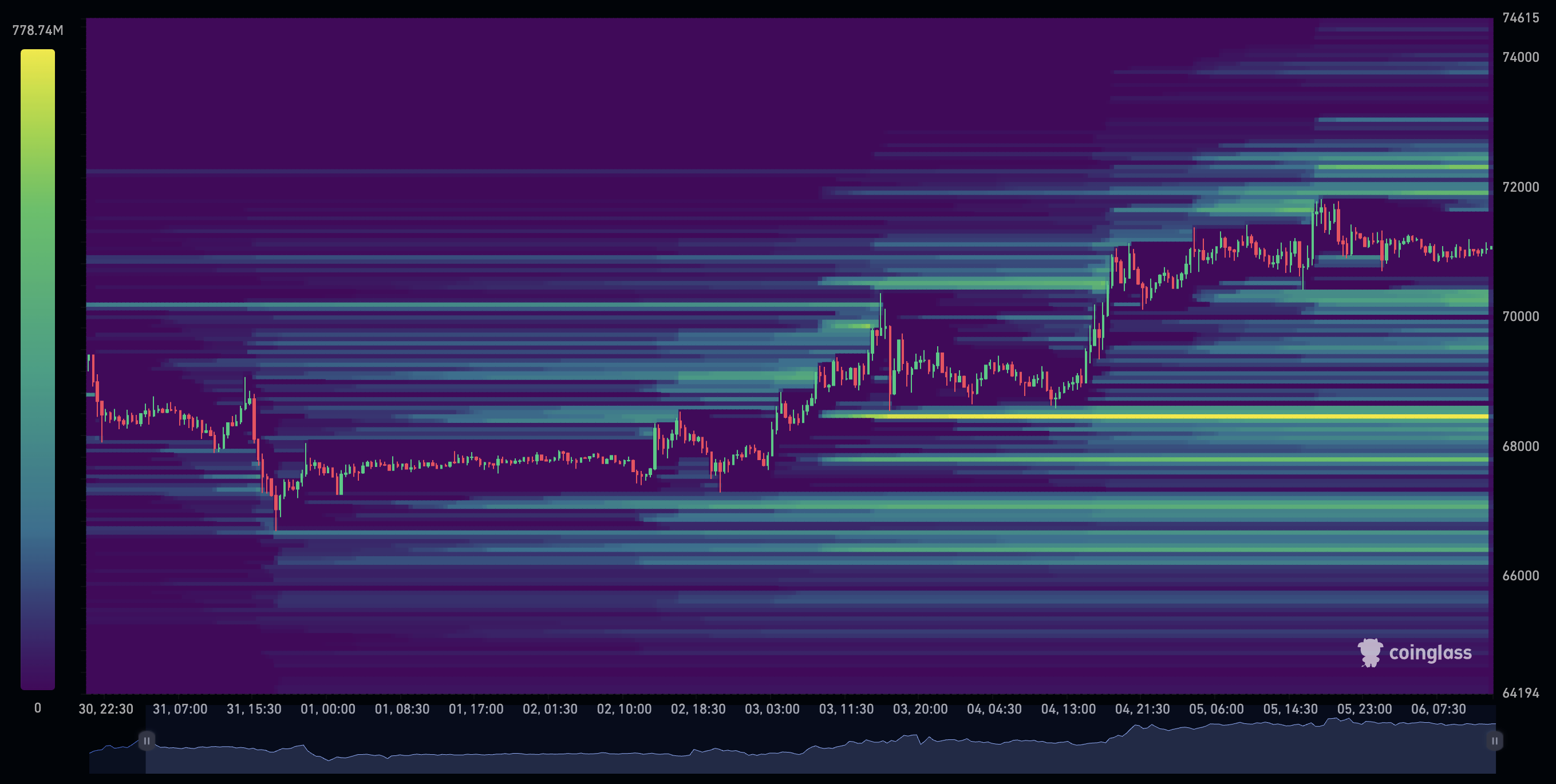
In the chart above, you can see a clear yellow line below the current Bitcoin price. This shows that at that specific level, many liquidations will occur if the price of Bitcoin meets that level. That directly shows as well that most traders are long, speculating that the price of Bitcoin will increase. Because if these traders were shorting Bitcoin, speculating that the price would decrease, the liquidation level would be above the current price. Because a short position can only be liquidated if the price moves in the opposite direction.
How to Read a Liquidation Heatmap in Simple Steps
-
Look for yellow zones above or below the current price.
-
Ask: Are most traders long or short? Where will they get liquidated?
-
Use those zones to adjust your entries or stop-loss levels.
Optional: You can view multiple metrics, like open interest, to see how much pressure there is on the price, or any other indicators that can help confirm your thesis or expectation.
How to Increase Heatmap Intensity
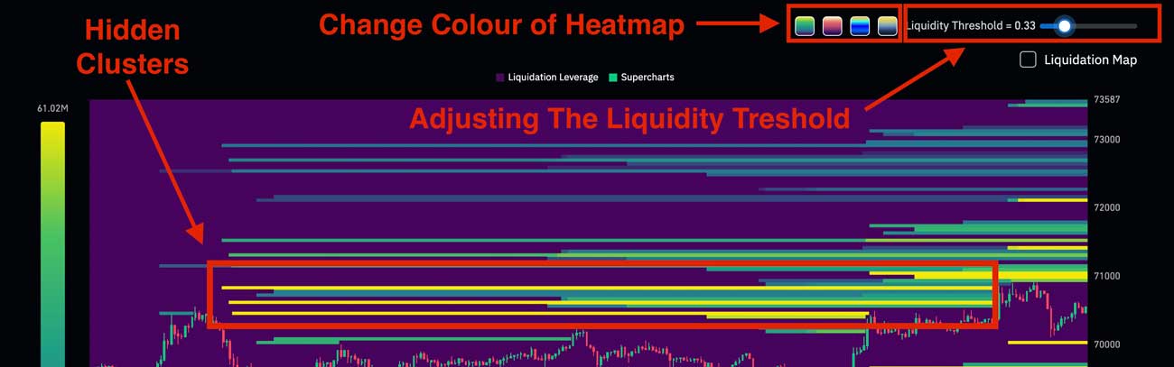
Sometimes the heatmap may look relatively empty, especially during quiet market conditions. This does not always mean there is no liquidity; it can simply mean the visual threshold is set too high.
By increasing the intensity (or sensitivity) in the settings, smaller liquidation clusters become visible. This helps traders detect areas that may still attract price, even if they are not immediately obvious.
Many beginners miss important levels simply because they are not displayed clearly. Adjusting the intensity allows you to uncover hidden liquidity and get a more complete picture of the market.
Tip: Use higher intensity settings in your analysis to uncover smaller or hidden liquidation clusters and observe how price reacts around them. These levels are often especially useful on lower timeframes, where short-term liquidity can trigger quick moves.
Optional: You can also adjust the colours of the Liquidation Heatmap.
How can you use the Liquidation heatmap?
You can use the liquidation heat map in multiple ways for your trading and price predictions on Bitcoin and other cryptocurrencies.
- Magnet: The concentrated liquidity may act as a magnet for the price, as the market mechanism of supply and demand often seeks places with the most liquidity. The chances increase that the price meets the levels where many liquidations are concentrated. When these levels are triggered, forced market orders from liquidated traders can accelerate the move even further, often creating sharp spikes in volatility.
- Support and Resistance: Traders can use these zones as well to look for potential support and resistance levels. These levels can be used as entry or exit levels or be seen as important levels to watch for traders.
- Confirmation of other indications: This metric can also be used to strengthen other metrics. So let’s say you use another indicator like the buying and selling pressure heat map. If there is a lot of selling pressure, and a possible liquidation event is below the current price levels, they might complement each other and increase the chances of a declining Bitcoin price.
Example of Liquidation Heatmaps in Action
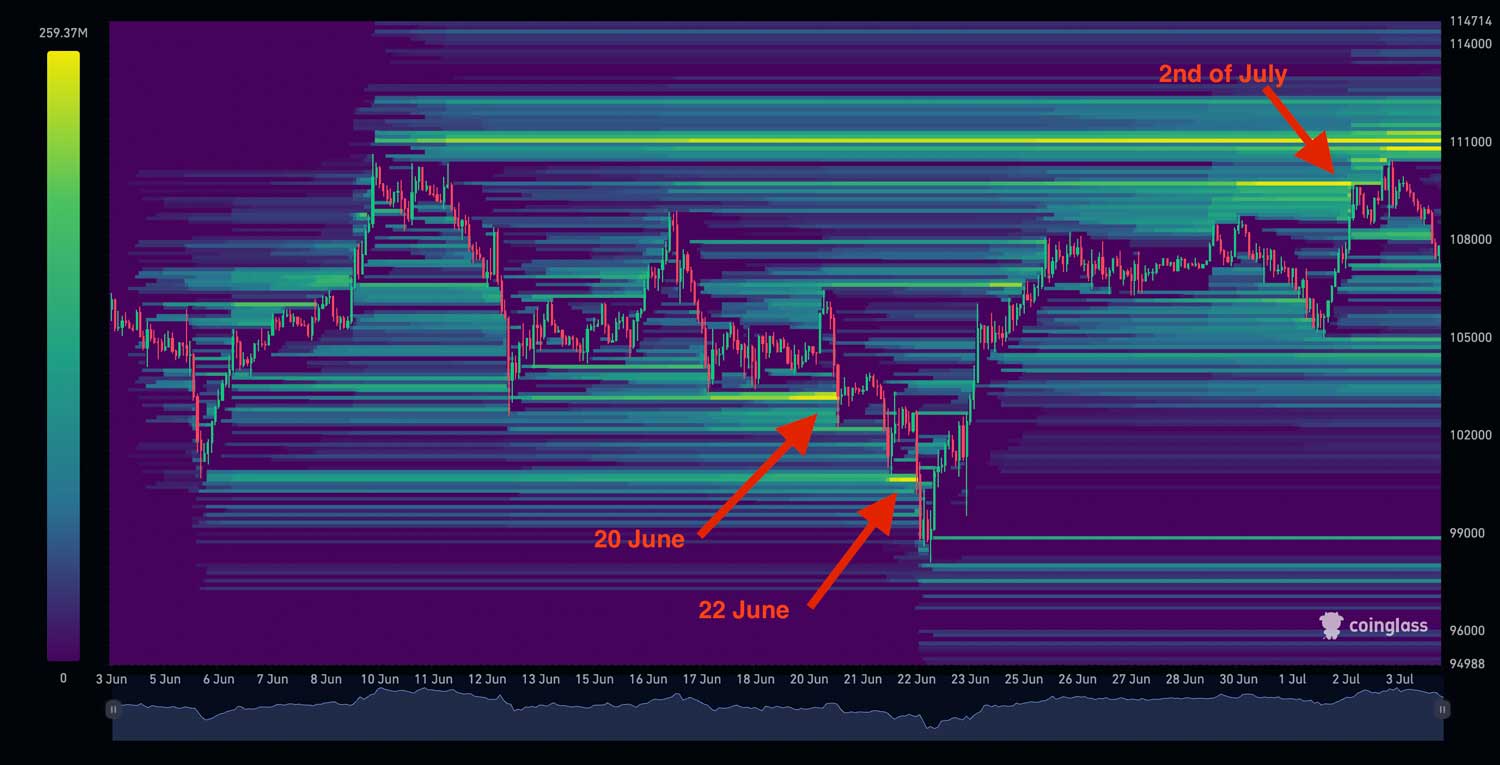 In the liquidation heatmap above, you can see very clearly that on the 20th of June, the price went into the yellow zone, the liquidation zone. Afterwards, on the 22nd of June, it tapped into the next liquidation zone (yellow). While most liquidations below the price have been cleared, the price of Bitcoin then went onward to reach the liquidation zone above until the 2nd of July. This illustrates how liquidation zones can function as a magnet for the price. The price goes where liquidity is concentrated.
Common Mistakes When Using Liquidation Heatmaps
Liquidation heatmaps are a powerful tool, but they are often misunderstood. While they can help identify important price levels, they should not be used on their own or interpreted too literally. Below are some common mistakes traders make when using liquidation heatmaps.
Expecting the price to move there immediately
Liquidation zones show where a lot of traders will be liquidated, not when the price must go there. The price can move sideways or even in the opposite direction first, especially when the market is trending strongly.
Using liquidation heatmaps as a standalone tool
Some traders rely only on liquidation levels to predict price movements. While this can work at times, the accuracy improves a lot when liquidation heatmaps are combined with other indicators such as price structure, sentiment, or buying and selling pressure. If you’re unsure which ones actually matter, it helps to understand the most important crypto trading indicators.
Ignoring different timeframes
Liquidation heatmaps look different on short and long timeframes. Short-term liquidity can sit below the price, while larger liquidation zones are still above it. This often means the price may move down first before continuing higher.
Focusing on just one exchange
Liquidation levels are more reliable when they appear across multiple exchanges. If a liquidation zone only exists on one platform, its impact on the overall market may be limited.
Key takeaway
Liquidation heatmaps increase the probability of certain price moves, but they are not guarantees. They work best as a confirmation tool within a broader trading strategy and should always be used together with proper risk management.
The power of combining Bitcoin heat maps
There are various types of heat maps that visualize specific data on the Bitcoin chart. In this article, we’ve discussed the liquidation levels, but there are also heat maps that visualise sentiment or buying and selling pressure. The major advantage of a heat map is its easy readability, providing traders with a clear overview of the trends and patterns. Combining these heat maps together makes them even more powerful.
Buying and selling pressure heatmap
The buying and selling pressure heatmap shows exactly when there is buying or selling pressure present in the markets.
In the chart above you can see exactly whenever there is buying pressure (green dots) or decreased selling pressure, the price goes up. Now if you combine this with the liquidation heatmap, they can complement each other. Let’s have a look at the first green box.
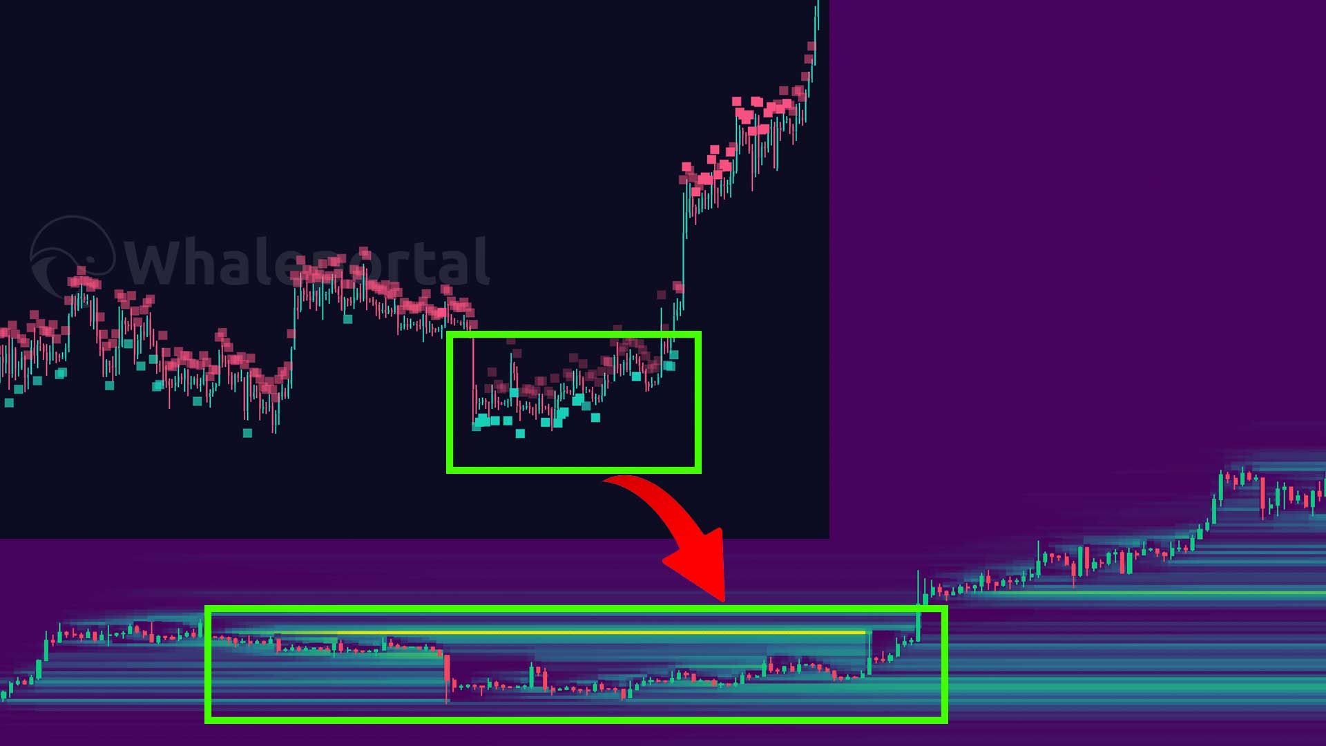
That green box was a consolidation period where Bitcoin moved mainly sideways, preparing for a bigger move to the upside. But, most traders did not expect this move, as you can see the liquidation level was above the price, showing that most traders were actually shorting the market. If you have looked at the liquidation heatmap combined with the buying and selling pressure heatmap, you could see that both datasets would point towards a price increase for Bitcoin.
Did you know?
Whaleportal is the first platform to offer real-time buying and selling pressure heatmaps, which you can combine with the liquidation heatmap for a complete picture of market sentiment.
Who Should Use a Liquidation Heatmap?
This tool is useful for:
-
Day traders who want to identify potential reversal points and avoid getting caught in liquidation spikes.
-
Swing traders looking to enter or exit around key support and resistance zones.
-
Leverage traders who want to see where large groups of positions are likely to be liquidated.
-
Active crypto traders on platforms like Bybit, Binance, or Bitget who rely on technical analysis.
-
Traders learning to interpret market sentiment and price movement using real-time data.
This tool is not designed for:
-
Long-term investors or "HODLers" who are not concerned with short-term price movements.
-
Anyone looking for long-term fundamental analysis rather than short-term trading insights.
Conclusion
In short, Bitcoin liquidation heatmaps are a powerful tool that can improve your trading strategy. These heatmaps show where major liquidation events are likely to happen, helping you predict price movements more accurately. By spotting areas with high liquidity, you can identify price levels Bitcoin is likely to revisit, using these as key indicators for support, resistance, and overall market direction.
When you combine liquidation heatmaps with other types of heatmaps, like buying and selling pressure heatmaps, you get an even clearer picture of market trends. This combination helps confirm your predictions and makes your trading decisions more reliable. The real advantage of these tools is how they turn complex data into easy-to-read visuals, making them useful for both new and experienced traders.
FAQ: Bitcoin Liquidation Heatmaps
What is a liquidation heatmap?
A liquidation heatmap is a visual chart showing where many traders are likely to get liquidated. These zones often appear as colored areas (from blue to yellow) based on how much leverage is stacked at specific price levels.
How do I read a liquidation heatmap?
-
Yellow areas = high liquidation risk. If the price hits these zones, many traders may be forced out of their positions.
-
Blue areas = low liquidation activity.
The closer the price gets to a yellow zone, the more likely a sudden move or "liquidation cascade" might happen.
Why does price often move toward liquidation zones?
Liquidation zones act like magnets. When there’s a large amount of liquidity at a specific level, market makers and algorithms may push prices toward those zones to trigger stop-losses and liquidations, creating volatility and opportunity.
Can I use this with other indicators?
Yes. Liquidation heatmaps work well alongside:
-
Support and resistance levels
-
Whaleportal’s buying and selling pressure heatmap (for extra confirmation)
Does this work for all coins or just Bitcoin?
Liquidation Heatmaps are available for most trading pairs, including Bitcoin, Ethereum, XRP, and many more.
Is a liquidation heatmap useful for long-term investors?
Not really. If you're holding crypto for months or years, short-term liquidation data won't add much value. This tool is best suited for short- to mid-term traders using technical setups or leverage.
Where can I access a live liquidation heatmap?
You can use the live Bitcoin liquidation heatmap directly on Coinglass.com
Related Articles:
- Best Crypto Exchanges for Passive Income 2025
- Apex Omni Tutorial
- Best Crypto Deposit Bonuses 2025