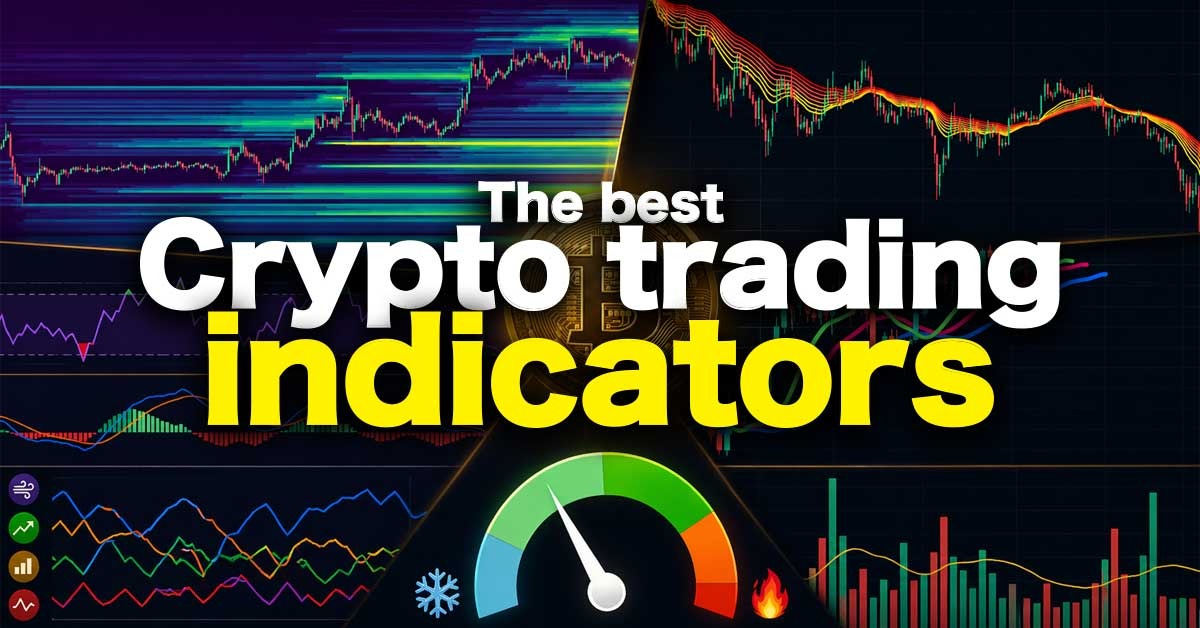
The Best Crypto Trading Indicators (Most Traders Use Them Wrong)
The Only Crypto Trading Indicators You Need (And How to Actually Use Them Together)
There are thousands of indicators traders use to predict price movements, but most of them don’t actually give you an edge. Many are lagging by design, and even worse, most traders use them without truly understanding how they work.
In this article, you’ll discover the key indicators that actually matter for analyzing the cryptocurrency market. More importantly, you’ll learn how to combine them effectively, because real insight doesn’t come from a single tool, but from how they work together.
By the end, you’ll have a clear understanding of which indicators fit your strategy, and the confidence to make smarter, more informed trading decisions.
In short: Most indicators are useless, but if you understand the right ones, they can give you a much more realistic perspective on the market and its direction.
What Are Indicators
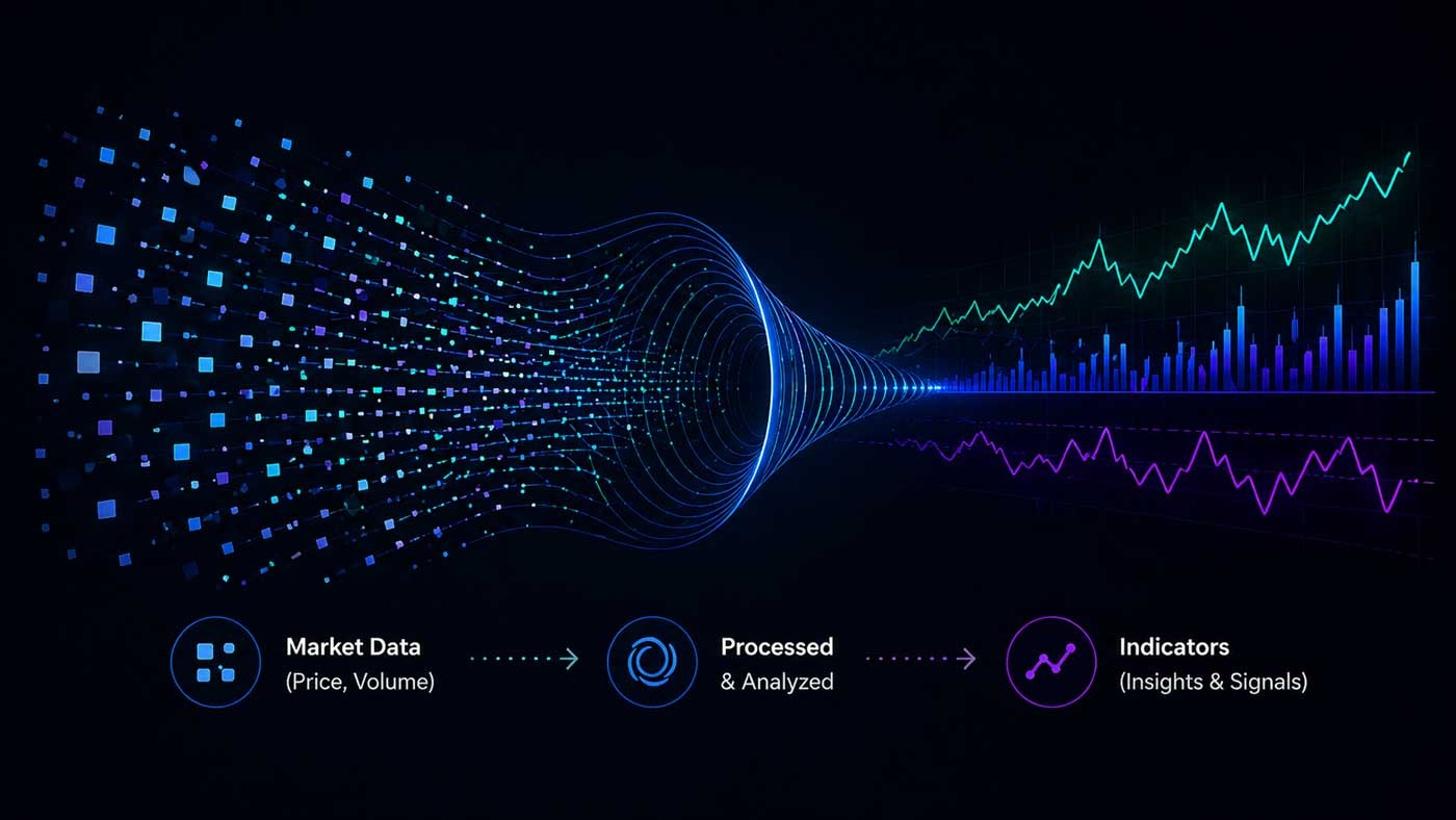
In short: Indicators are tools that take data (e.g., price and volume) and turn them into signals that help you understand what the market is doing.
Technical indicators are tools that analyze price, volume, or market behavior to help traders make decisions. Indicators help you see patterns in price that aren’t obvious at first glance. It’s processed or calculated data, often visualized to spot certain patterns or at least give a better understanding of the market conditions. They don’t predict the future; they help you make better decisions by showing trends, momentum, and possible turning points.
Most indicators are based on historical data, which means they often react after a move has already started. These are called lagging indicators, and they are mainly used to confirm trends.
On the other hand, some indicators are designed to react faster to price changes. These are often called leading indicators, and they aim to signal potential reversals or entry points earlier, though they can be less reliable and produce more false signals.
And in crypto, indicators go beyond charts. They can also track market sentiment, capital flows between sectors, or even real-time trades of whale traders.
Types of Indicators
There are many different types of indicators. Some are simple, like the RSI, while others are more advanced, such as liquidation heatmaps that visualize real-time exchange data. Even funding rates or overall market sentiment can be used as indicators.
This shows how broad the spectrum really is. Indicators are not limited to price charts; they can reflect positioning, sentiment, liquidity, and behavior across the market.
Because of this, it’s important to understand why an indicator adds value, not just how to use it.
It’s also crucial to realize that there is no single “magic” indicator with perfect accuracy. The real edge comes from combining different types of indicators and interpreting them in the right context.
Let’s first look at the most important categories of indicators before diving into specific examples.
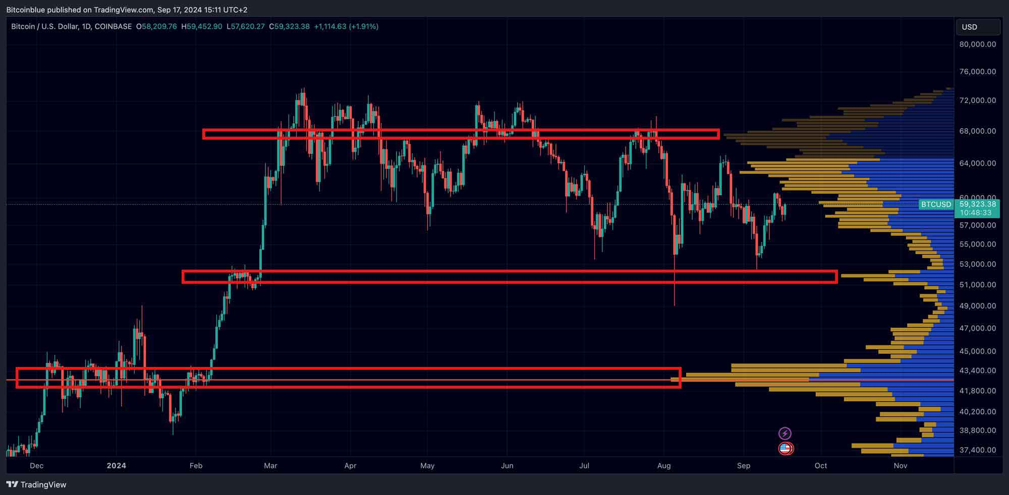
Price Structure & Cycles
One of the most fundamental ways to analyze the market is by studying price structure.
While not always considered a traditional indicator, price structure works in a similar way; it helps you interpret chart data and turn it into actionable signals.
By identifying patterns such as support and resistance, trendlines, and market structure (higher highs and higher lows), traders can better understand how the market is behaving. Breakouts, breakdowns, and retests of key levels often act as important signals.
This approach is widely used for a reason:
it reflects how market participants actually interact with price.
The Role of Time
Time is one of the most overlooked elements in trading.
Most traders focus almost entirely on price, but time, shown on the x-axis of the chart, can provide valuable insight into market behavior. Not asking where (price), but when (time).
Markets often move in cycles, and recognizing these cycles can help you understand where you are in a larger trend.
Well-known examples include:
- The Bitcoin 4-year cycle
- Shorter-term cycles, such as the Bitcoin 60-day cycle
Cycles can be seen as a form of indicator that focuses on timing rather than price.
Summary: Price structure tells you what the market is doing, and cycles help you understand when something might happen.
Technical Indicators (Price-Based)
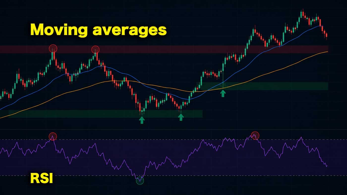
Technical indicators are the most widely used type of indicators in trading. They are based on price and volume data and are typically displayed directly on a chart.
Examples include the Relative Strength Index (RSI), Moving Averages, and the MACD, but you can also think of an EMA ribbon or Williams Alligator.
What makes technical indicators powerful is that they turn raw price data into something easier to interpret. Instead of looking at chaotic price movements, traders can quickly identify trends, momentum, and potential reversal points.
Most technical indicators fall into a few key categories:
- Trend indicators: show the direction of the market (e.g. Moving Averages)
- Momentum indicators: measure the strength of a move (e.g. RSI, MACD)
- Volatility indicators: show how much the price is moving (e.g. Bollinger Bands)
- Volume indicators: confirm the strength behind a move
Technical indicators are especially useful for:
- Identifying trends
- Timing entries and exits
- Confirming trade setups
However, it’s important to understand their limitation:
They are based on historical price data, which means they often react to the market rather than predict it. And in our experience, they are among the least effective when used on their own, especially when they are not combined with other market data sets.
That’s why experienced traders don’t rely on a single indicator. Instead, they combine multiple technical indicators, and often mix them with other types of data like sentiment or liquidity, to build a more complete view of the market.
Quick note: Technical indicators are the foundation of most trading strategies, but they become significantly more powerful when combined with other types of indicators, such as sentiment or order flow.
Summary: Technical indicators visualize price data to reveal trends and momentum. Because they are based on past data, they work best when combined rather than used alone.
Live exchange data & Liquidity Indicators (Order Flow)
Now we’re getting into one of the most interesting and unique categories of indicators, especially in crypto.
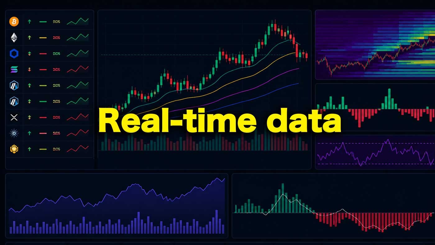
Unlike traditional financial markets, a large amount of crypto market data is publicly available. Most exchanges provide real-time data through APIs, giving traders direct insight into what is happening right now, not just what has already happened.
This adds a completely new dimension to market analysis.
Instead of only analyzing price, you can now analyze positioning, liquidity, and trader behavior in real time.
Examples of Live Market Data
One of the most well-known examples is the funding rate. This metric shows whether more traders are positioned long or short at a given moment.
It gives you insight into market sentiment and positioning:
- High positive funding: crowded longs
- Negative funding: crowded shorts
This kind of data allows you to understand how traders are positioned, not just how price is moving.
Other important real-time indicators include:
- Open Interest
- Premium Index
- Taker Buy/Sell Ratio
Liquidity & Liquidation Data
Beyond positioning data, crypto also offers deep insights into liquidity.
Tools like liquidation heatmaps visualize where large clusters of leveraged positions are likely to be liquidated. These levels often act as magnets for price, as the market tends to move toward areas with high liquidity.
This makes them extremely valuable for:
- Identifying potential targets
- Spotting key levels
- Understanding market intent
If you want to know about how to use this tool, read our full guide on how to read liquidation heatmaps.
Decentralized Exchanges Transparency
With the rise of decentralized exchanges, transparency has increased even further.
On some platforms, you can:
- Analyze individual trader positions
- Track large wallets
- Monitor real-time changes in exposure
This allows traders to go beyond general market analysis and, in some cases, follow smart money behavior directly.
Summary: Crypto markets offer unique real-time data and insights into liquidity and trader positioning. This allows traders to understand what is happening in the market right now, rather than relying only on historical data.
Sentiment Indicators
You’ve probably heard the phrase: “Buy when others are fearful and sell when others are greedy.”
There’s a lot of truth to this.
At major market bottoms, sentiment is often dominated by fear, panic, and uncertainty. At tops, the opposite happens, markets become driven by euphoria, overconfidence, and greed.
Understanding this emotional cycle can be extremely valuable.
Why Sentiment Matters
Sentiment indicators help you understand how the market feels, not just what the price is doing.
This allows you to answer key questions:
- Are we overextended?
- Is fear or greed dominating the market?
- Are traders positioned emotionally in one direction?
How to Use Sentiment
Sentiment can be used in two powerful ways:
1. Market Confirmation
You can use sentiment as an extra layer of confirmation.
For example:
- Extreme fear: potential opportunity
- Extreme greed: increased risk
2. Emotional Awareness
Sentiment also helps you manage your own decisions.
If your emotions match the market (e.g., feeling euphoric at highs), it can be a warning sign. This awareness helps you avoid emotional, impulsive trades.
Sentiment as an Edge
Think of sentiment as a filter on top of your strategy.
Let’s say your strategy has a 65% win rate. By adding sentiment as confirmation, you might:
- Take fewer trades
- Avoid low-quality setups
- Focus only on high-probability opportunities
The result? A cleaner strategy with potentially higher accuracy.
Summary: Sentiment is important; it helps you avoid emotional mistakes, identify extremes, and trade with a clearer understanding of where the market stands.
On-Chain Indicators
Because many crypto transactions happen publicly on the blockchain, traders have access to a unique set of data known as on-chain indicators.
These indicators track the behavior of wallets and tokens. For example, when coins that have been dormant for years suddenly start moving, it can signal a shift in holder behavior and potential selling pressure, especially if this happens on a larger scale.
On-chain data can provide valuable insights into long-term market cycles and investor behavior. It is particularly useful for identifying periods of accumulation or distribution.
However, in our experience, on-chain indicators are less reliable for short-term trading. They often require interpretation and can be misleading when viewed in isolation.
A common example is exchange inflows. When large amounts of Bitcoin are sent to exchanges, this is often interpreted as a sign of incoming selling pressure. While this can be true, it is not always the case. Funds may also be moved for internal exchange operations or used as collateral in derivatives trading.
This highlights an important point: on-chain data is nuanced and can easily be misinterpreted.
How to Use On-Chain Data
On-chain indicators work best as a supporting layer, rather than a primary signal.
When combined with other indicators, such as sentiment, funding rates, or technical signals, they can help strengthen a broader market view.
For example, if multiple signals align:
- High funding rates
- Euphoric sentiment
- Increasing exchange inflows
- Dormant tokens suddenly move
This confluence can provide stronger evidence that the market may be approaching a top. And that old holders are intending to sell.
Summary: On-chain indicators offer valuable insight into long-term behavior and market structure, but they are most effective when used alongside other types of indicators rather than on their own.
Best Indicators
Now that you understand the different types of indicators, it’s time to focus on the ones that actually give traders an edge.
Based on our research, these are the most effective indicators for analyzing the crypto market.
No indicator can predict price with perfect accuracy, and trying to achieve that is the wrong approach. Markets are dynamic and often unpredictable.
The real objective is to stack probabilities in your favor.
By combining the right indicators, you can improve your decision-making, identify higher-quality setups, and reduce risk, ultimately increasing your overall profitability.
EMA Ribbon (Trend & Momentum Indicator)
The EMA Ribbon is a trend-following indicator that combines multiple Exponential Moving Averages (EMAs) into a single visual “ribbon” on the chart. Because EMAs react quickly to price changes, the ribbon provides a clear view of both trend direction and momentum.
When the price is above the ribbon, and the lines are spread out, it signals a strong uptrend. When the price is below, it indicates a downtrend. A tightening ribbon often suggests that momentum is slowing and a larger move may be coming.
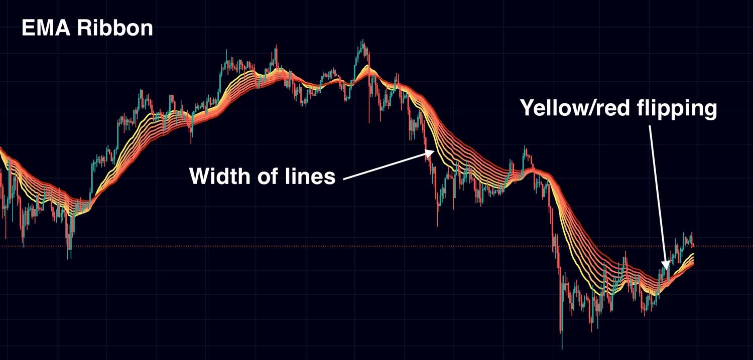
Traders use the EMA Ribbon to:
- Identify trend direction (Direction of lines)
- Measure trend strength (Width of lines)
- Spot potential reversals or breakouts (Flipping of the colours)
- Find dynamic support and resistance levels
Like most technical indicators, the EMA Ribbon works best in trending markets and can produce false signals in sideways conditions.
Summary: The EMA Ribbon is most effective when used as part of a broader strategy. Combining it with other indicators, such as sentiment, funding rates, or price structure, helps confirm signals and filter out noise.
Timeframe: Most effective on 4H or 1D
Williams Alligator (Trend Filter Indicator)
The Williams Alligator is a trend-following indicator that uses three smoothed moving averages, called the Jaw, Teeth, and Lips, to show whether the market is trending or moving sideways.
Visually, it looks similar to an EMA Ribbon, but instead of many lines, it uses three key averages that are slightly shifted forward. This creates a smoother, more delayed view of the market.
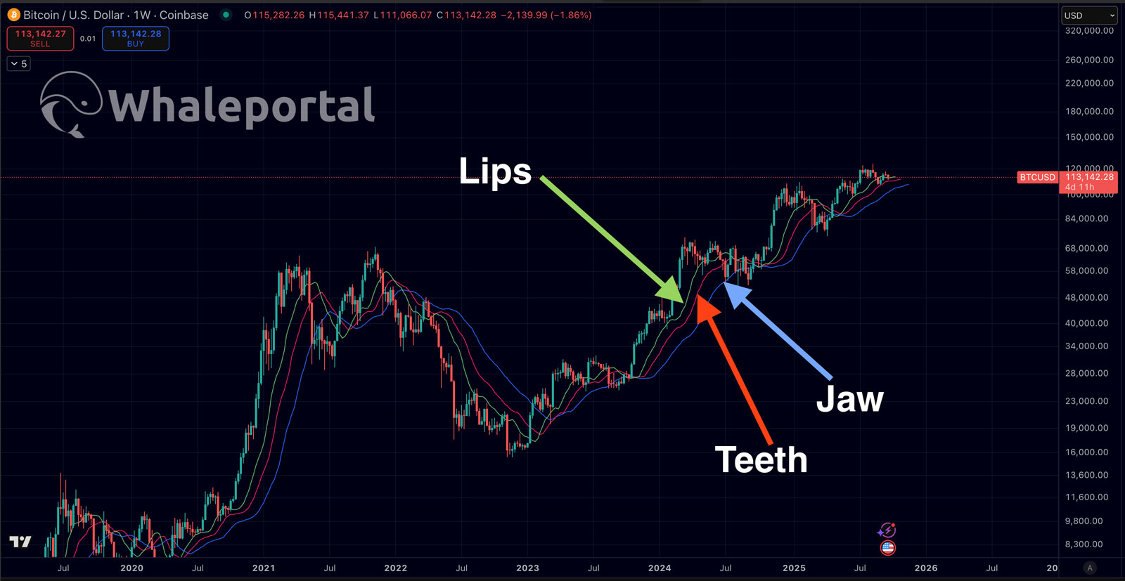
When the lines are close together, the market is ranging (low activity). When they start spreading apart and align in one direction, it signals the start of a trend. The wider the distance between the lines, the stronger the trend.
Traders use the Alligator to:
- Identify whether the market is trending or ranging
- Spot early trend formations (lines spreading apart)
- Stay in strong trends (lines clearly separated)
- Detect when a trend is weakening (lines coming back together)
Limitations: Like all moving average-based indicators, the Alligator is lagging by nature.It performs best in trending markets and can give false signals in choppy conditions.
Summary: The Williams Alligator helps you filter out sideways markets and focus only on strong trends. It is most effective when combined with faster indicators (like the EMA Ribbon) or confirmation tools such as sentiment and order flow.
Timeframe: Most effective on 4H or higher
Liquidation Heatmaps
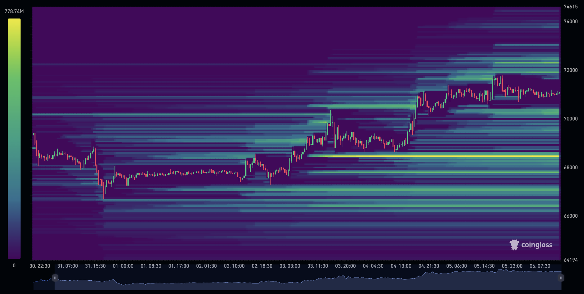
Liquidation heatmaps are a real-time indicator that shows where large clusters of leveraged positions are likely to be liquidated. These zones represent areas of high liquidity in the market.
When many traders are positioned in the same direction, their liquidation levels often stack around specific price levels. These levels are visualized on the heatmap using colors, typically ranging from blue (low liquidity) to yellow (high liquidity).
Because liquidations trigger forced market orders, these zones often act as magnets for price, attracting price movement toward them and sometimes accelerating volatility once reached.
Traders use liquidation heatmaps to:
- Identify high-liquidity zones (potential price targets)
- Anticipate where stop losses and liquidations are clustered
- Spot potential support and resistance levels
- Understand market positioning (are traders mostly long or short?)
- Confirm setups with other indicators
How to Read It (Simple)
- Yellow zones: high liquidation clusters (strong interest)
- Blue zones: low activity
- Liquidity below price: many longs (liquidation downside)
- Liquidity above price: many shorts (liquidation upside)
Limitations: Liquidation heatmaps do not tell you when the price will move to a level, only where liquidity is located. They can also be misleading when used alone, especially in strong trending markets or when liquidity is spread across multiple levels.
Summary: Liquidation heatmaps provide a powerful view into market liquidity and positioning. They help you understand where price is likely to move, but are most effective when combined with trend indicators, sentiment, and price structure.
Timeframe: Most effective on lower to mid timeframes (1H–4H), but valuable across all timeframes
Altcoin Season Index (Market Rotation Indicator)
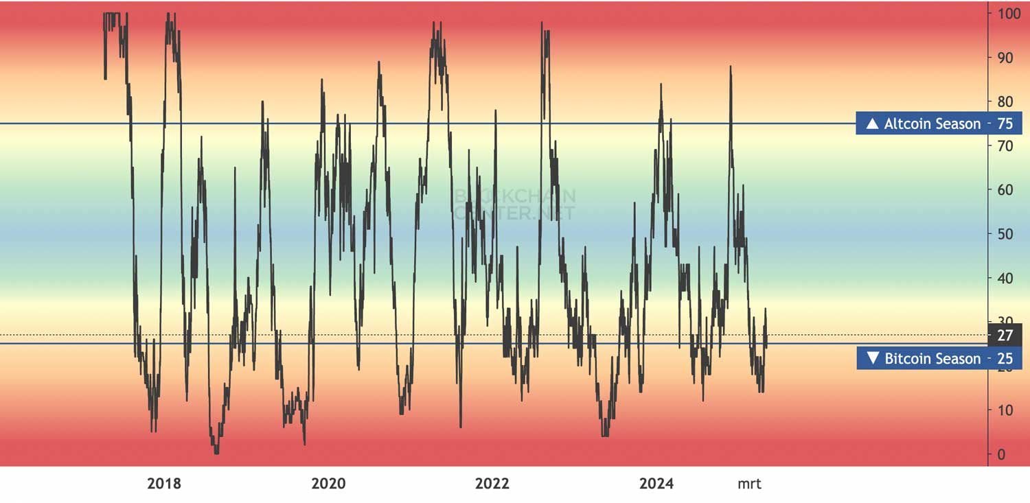
The Altcoin Season Index is a market-wide indicator that shows whether altcoins are outperforming Bitcoin. It helps traders understand where capital is flowing, either into Bitcoin or into the broader altcoin market.
The index is based on the performance of the top altcoins over a set period (typically 30 or 90 days). When a large percentage of these coins outperform Bitcoin, the market is considered to be in altcoin season.
Traders use the Altcoin Season Index to:
- Identify whether capital is flowing into altcoins or Bitcoin
- Adjust portfolio allocation (BTC vs altcoins)
- Avoid being positioned in the wrong phase of the cycle
How to Read It (Simple)
- 0–25: Bitcoin Season (BTC outperforming)
- 26–74: Neutral market
- 75–100: Altcoin Season (alts outperforming)
Summary: The Altcoin Season Index is a confirmation tool, not a predictive one. It tells you what has already been happening in the market, helping you align with the current trend rather than fight it.
Crypto Sector Performance Index
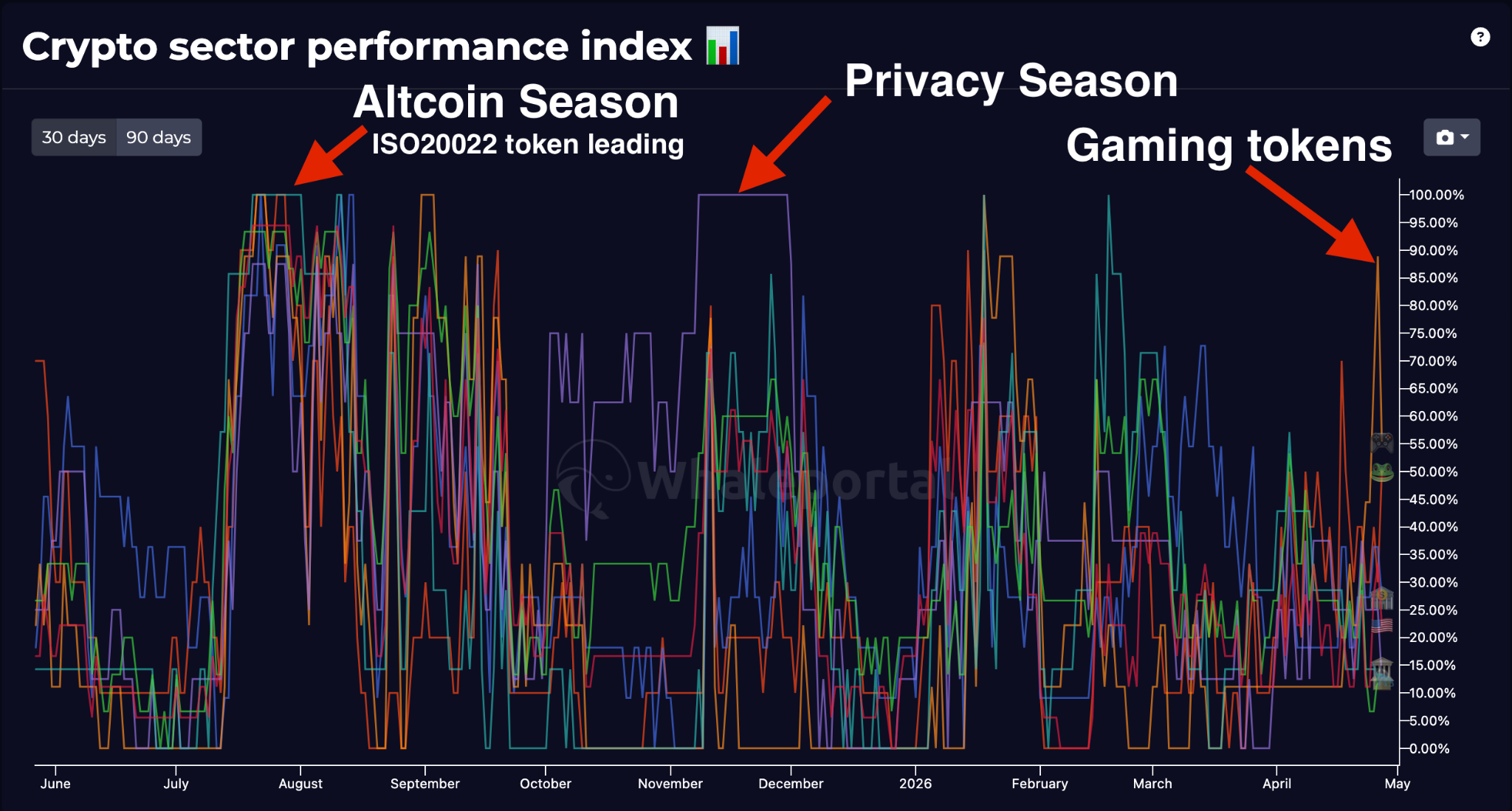
A more advanced approach is using the crypto performance index, which tracks how different altcoin sectors perform relative to Bitcoin.
Instead of focusing on the entire altcoin market, this indicator shows:
Which specific sectors are outperforming right now?
This gives a much stronger edge:
- Identify where liquidity is actually flowing
- Focus only on strong narratives
- Find opportunities within outperforming sectors
- Avoid weak or inactive categories
Why This Matters
Crypto markets are driven by narratives and hype cycles. Liquidity moves from one sector to another, not into all altcoins at once.
For example:
- ISO20022 tokens are dominating one phase
- Privacy coins are leading another
While certain token sectors have been very strong, the rest of the altcoin market hasn’t shown the same amount of strength. By tracking sector performance, you can position yourself earlier and more precisely.
Summary: The Altcoin Season Index helps you understand when altcoins are strong. The Crypto Performance Index helps you understand which altcoins to focus on. Combining both allows you to follow capital rotation more accurately and find higher-probability opportunities.
Timeframe: Most useful on higher timeframes (daily/weekly)
Funding Rates (Sentiment & Positioning Indicator)
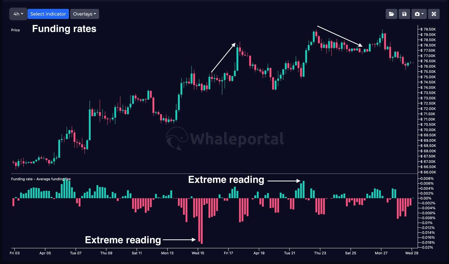
Funding rates are a real-time indicator used in perpetual futures markets to show how traders are positioned. In simple terms, they are periodic payments between long and short traders, designed to keep the futures price close to the spot price.
When the funding rate is positive, long traders pay short traders, meaning most traders are positioned bullish. When the funding rate is negative, short traders pay longs, indicating a bearish market bias.
Traders use funding rates to:
- Understand market sentiment (bullish vs bearish positioning)
- Identify crowded trades
- Add confirmation to trade setups
How to Read It (Simple)
- Positive funding: more longs (bullish crowd)
- Negative funding: more shorts (bearish crowd)
- Neutral funding: balanced market
Extreme readings are where it gets interesting.
How to Use It
Funding rates are most powerful when combined with other indicators.
For example:
- Bullish setup + extremely negative funding → stronger long signal
- Bearish setup + extremely positive funding → stronger short signal
Limitations: Funding rates do not predict direction on their own. Markets can stay over-leveraged for extended periods, especially during strong trends.
Summary: Funding rates provide real-time insight into market sentiment and positioning. They are especially useful for spotting crowded trades and potential reversals, but work best when combined with trend, liquidity, or price structure.
Timeframe: Most effective on lower to mid timeframes (1H–4H)
Premium Index (Market Imbalance Indicator)
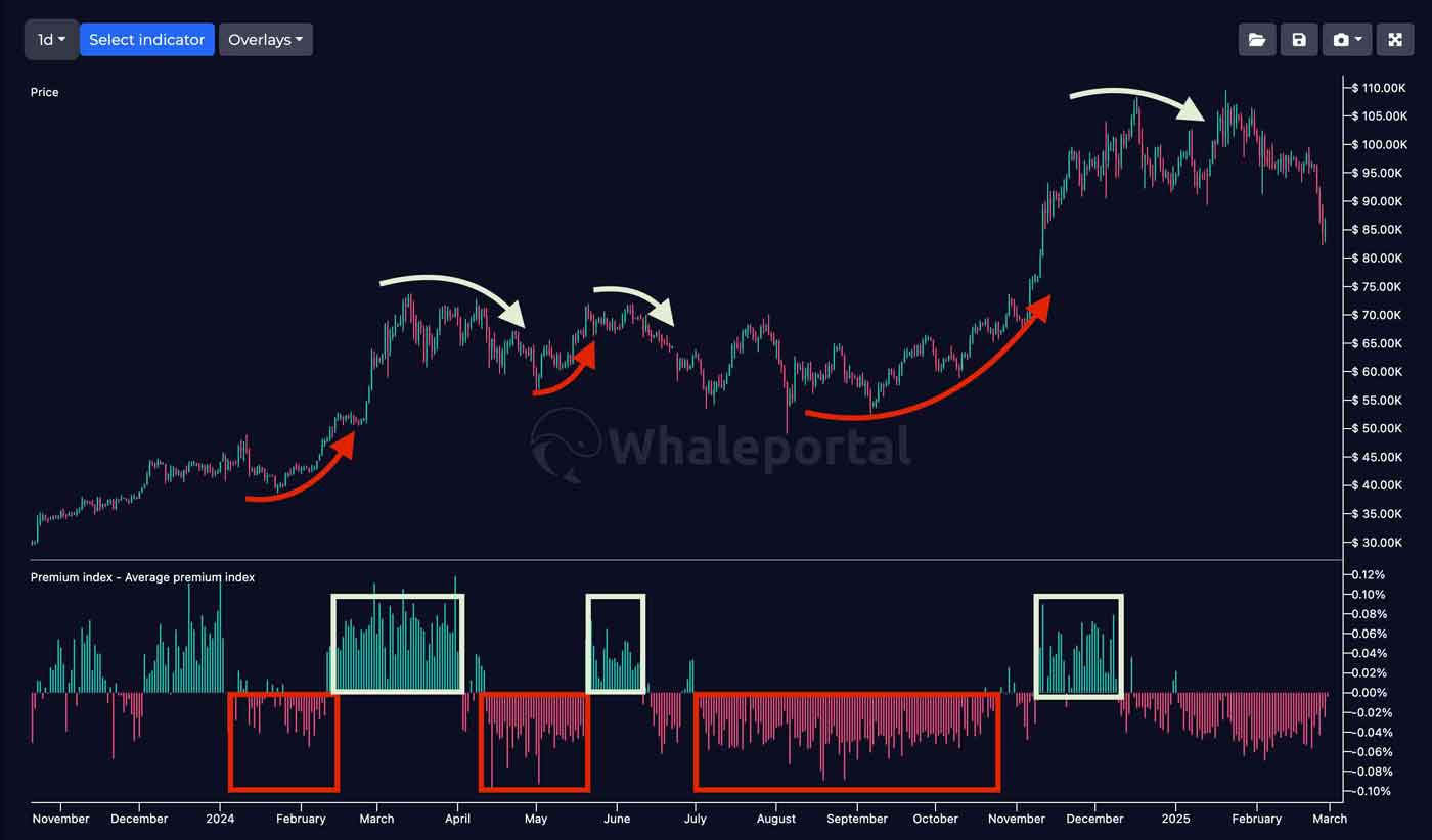
The Premium Index is a real-time indicator that shows the difference between the spot price and the futures (perpetual) price of an asset.
It helps traders understand whether the market is driven more by real demand (spot) or leveraged speculation (derivatives).
When the futures price is higher than the spot price, the market is trading at a premium (bullish speculation). When it is lower, the market is trading at a discount (more cautious or bearish sentiment).
Traders use the Premium Index to:
- Measure the level of speculation in the market
- Identify overheated or overleveraged conditions
- Spot potential reversal zones
- Confirm sentiment with other indicators
How to Read It (Simple)
It works similarly to funding rates and can be used as a complementary indicator.
- Positive premium → futures above spot → high speculation
- Negative premium → futures below spot → lower speculation
The longer and stronger the deviation, the more important the signal becomes.
Premium Index vs Funding Rates
While both indicators measure sentiment, they focus on different aspects:
- Funding Rates → positioning (longs vs shorts)
- Premium Index → pricing imbalance (spot vs derivatives)
Combined, they provide a much clearer picture of market conditions.
Limitations: The Premium Index does not predict exact timing. Markets can remain overleveraged or imbalanced for extended periods during strong trends.
Summary: The Premium Index reveals whether the market is driven by real demand or speculative leverage. It is a powerful tool for spotting imbalances, but it works best when combined with funding rates, liquidity data, and trend indicators.
Timeframe: Most effective on 1H–1D
You can read more about the premium index in our premium index explained article.
Taker Buy/Sell Ratio (Short-term Sentiment Indicator)
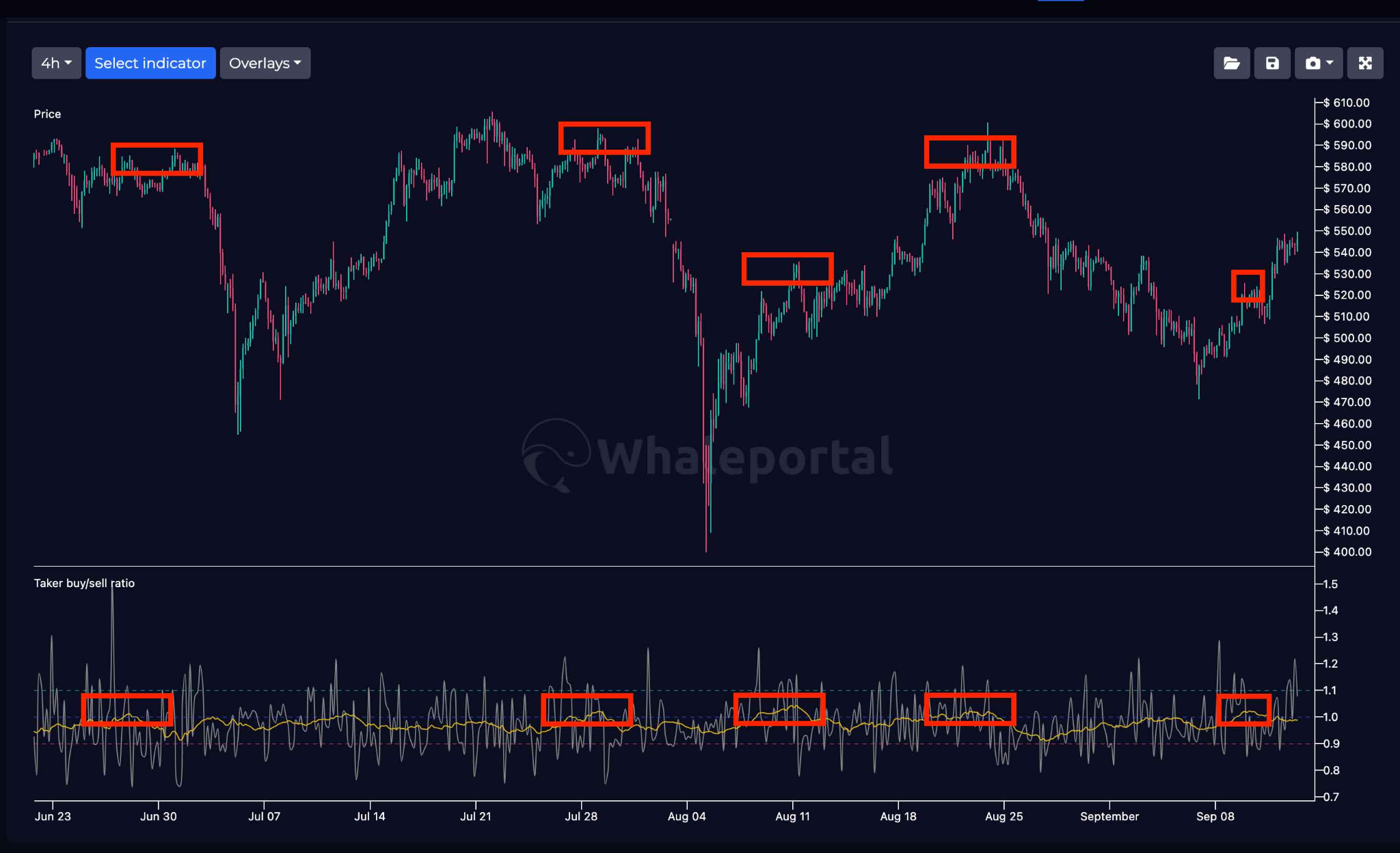
The Taker Buy/Sell Ratio is a real-time indicator that shows whether traders are opening more buy (long) or sell (short) positions using market orders.
Because market orders are executed instantly (often at a worse price), this indicator reflects aggressive behavior and emotion in the market.
Traders use the Taker Buy/Sell Ratio to:
- Identify short-term sentiment (bullish vs bearish pressure)
- Spot FOMO or panic in the market
- Confirm other indicators
How to Read It (Simple)
- Above 1 → more aggressive buyers (longs)
- Below 1 → more aggressive sellers (shorts)
- Around 1 → balanced market
How to Use It
The indicator is most powerful when used against the crowd:
- High ratio + bullish trend → potential exhaustion
- Low ratio + bearish sentiment → potential bounce
It works especially well when combined with:
- Funding rates
- Liquidation heatmaps
- Price structure
Limitations: The Taker Buy/Sell Ratio is short-term focused and can be noisy. Extreme readings can persist during strong trends.
Summary: The Taker Buy/Sell Ratio reveals real-time trader behavior and emotional pressure in the market. It is most effective for spotting short-term extremes and works best as a confirmation tool alongside other indicators.
Timeframe: Most effective on lower timeframes (minutes – 1H)
For more information, have a look at our Taker buy/sell ratio explained article with some real examples.
VPVR (Volume Profile Indicator)
The Volume Profile Visible Range (VPVR) is a technical indicator that shows how much trading volume has occurred at specific price levels within the visible chart.
Instead of showing volume over time (like regular volume bars), VPVR shows where volume is concentrated, helping traders identify key price levels where the market has shown strong interest.
Traders use VPVR to:
- Identify strong support and resistance levels
- Find high-interest price zones (high volume nodes)
- Detect low-volume areas where price can move quickly
- Confirm trends and breakouts
- Understand where the market has accepted or rejected the price
How to Use It
VPVR works best when combined with other indicators:
- Use it with trend indicators (EMA / Alligator) to find entries
- Combine with liquidation heatmaps to align liquidity and structure
- Use with sentiment indicators to confirm reactions at key levels
Limitations: VPVR is dependent on the visible range of the chart. Different zoom levels can show different volume structures, so context is important.
Summary: VPVR helps traders understand where volume is concentrated, revealing key support and resistance levels. It is especially useful for identifying high-probability zones, but it works best when combined with trend, liquidity, and sentiment indicators.
Timeframe: Works across all timeframes, best on 1H and higher
Buying & Selling Pressure Heatmap (Real-Time Order Flow Indicator)
The Buying & Selling Pressure Heatmap is a real-time indicator that visualizes whether there is more buying or selling pressure in the market.
Instead of showing raw numbers, it uses color intensity to make market behavior easy to understand:
- Green zones: increasing buying pressure
- Red zones: increasing selling pressure
This allows traders to quickly see where pressure is building and how it may influence price direction.
Traders use this heatmap to:
- Identify shifts in buying or selling pressure
- Spot potential continuation or exhaustion of trends
- Understand short-term market behavior
- Confirm other indicators
How to Read It (Simple)
- Green intensity increasing: buyers gaining control
- Red intensity increasing: sellers gaining control
- Decreasing intensity: pressure fading
Changes in intensity are often more important than the color itself.
Key Insight
This heatmap shows real-time pressure, not just price.
- Strong trend + decreasing opposing pressure: continuation likely
- High pressure + weakening trend: potential reversal
It also helps identify whether the market is in a bullish or bearish environment.
Limitations: Buying and selling pressure do not guarantee direction. Strong trends can continue even against short-term pressure.
Summary: The Buying & Selling Pressure Heatmap provides a clear view of real-time market pressure. It helps traders understand who is in control, but is most effective when combined with trend, liquidity, and sentiment indicators.
Timeframe: Effective on lower to mid timeframes (5m–1D)
Moon Cycle Indicator (Alternative Timing Indicator)
The Moon Cycle Indicator is an alternative timing tool that tracks lunar phases, mainly the new moon and full moon, to look for possible repeating patterns in Bitcoin price behavior.
This is definitely not a traditional indicator, and it is not for everyone. Many traders will ignore it completely, and that is understandable. However, for traders interested in cycles, timing, and market psychology, moon phases can be an interesting extra layer of analysis.
The idea is that lunar cycles may influence human emotions and market sentiment, which could indirectly affect financial markets.
Traders use moon cycles to:
- Add a timing layer to their strategy
- Look for recurring market rhythms
- Combine lunar phases with price structure
- Support cycle-based analysis, such as Bitcoin’s 60-day cycle
How to Read It (Simple)
- New moon → often watched for potential strength or turning points
- Full moon → often watched for potential weakness or reversals
- Full moon to new moon → sometimes associated with bullish price behavior
- New moon to full moon → sometimes associated with weaker price action
Limitations: Moon cycles should never be used as a standalone trading signal. The correlation is not strong enough to rely on by itself, and it remains a highly alternative approach.
Summary: The Moon Cycle Indicator is an unconventional timing tool that may help cycle-focused traders spot periods where market turns are more likely. It is best used only as a secondary confirmation tool, combined with price structure, funding rates, premium index, or broader Bitcoin cycle analysis.
Timeframe: Most useful on higher timeframes, especially daily charts.
CME Gaps
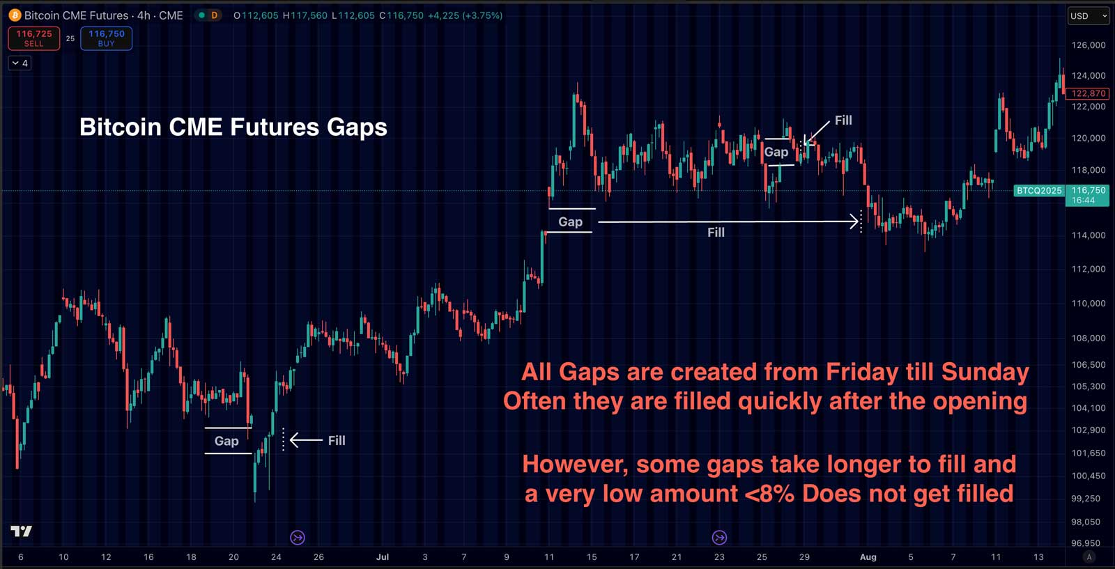
CME gaps are price gaps that appear on the Bitcoin futures chart on the Chicago Mercantile Exchange (CME). These gaps occur because CME trading closes over the weekend, while the crypto market continues trading 24/7.
When CME reopens, the price often differs from where it closed on Friday, creating a “gap” on the chart.
Traders use CME gaps to:
- Identify potential price targets
- Spot short-term inefficiencies in the market
- Improve entry timing
- Understand institutional price behavior
How to Read It (Simple)
- Gap above current price: potential upside target
- Gap below current price: potential downside target
Price has a strong tendency to revisit and “fill” these gaps over time.
Key Insight
CME gaps exist because of differences between institutional trading hours and the 24/7 crypto market.
Many traders believe:
- Weekend moves = lower liquidity → less reliable
- Weekday trading = institutional flow → price rebalances
This creates a statistical tendency for the price to return to the gap area.
How to Use It
CME gaps are best used as a target or confluence tool, not a standalone signal.
For example:
- Gap + liquidation cluster → stronger target
- Gap + resistance level → higher probability reaction
- Gap + sentiment extreme → potential reversal zone
Limitations: Not all gaps are filled immediately. Some gaps can take days or even weeks to close, especially during strong trends.
Summary: CME gaps highlight inefficiencies in the market and often act as magnets for price. They are useful for identifying potential targets, but work best when combined with trend, liquidity, and sentiment indicators.
Timeframe: Most relevant on 1D
Hyperliquid Wallet Data (Smart Money Indicator)
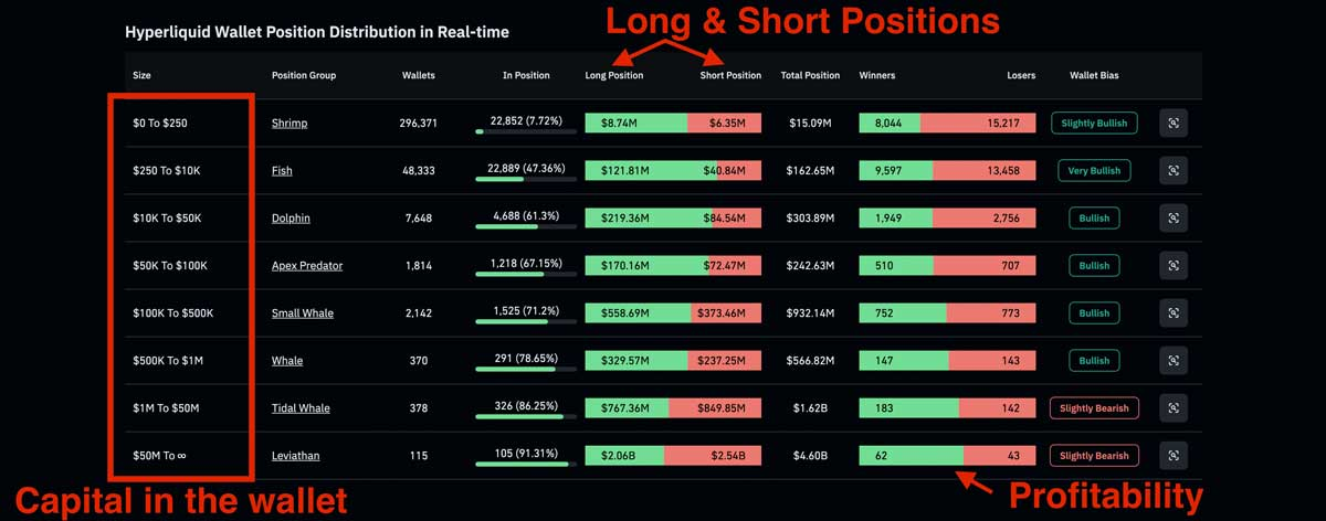
Hyperliquid adds a new layer of transparency to crypto trading. Because it is a decentralized exchange, trader wallets, open positions, leverage, and PnL can be viewed publicly.
This means you can analyze how different types of traders are positioned in real time, from smaller retail wallets to large whale wallets. In some cases, you can even track individual wallets and see whether they are long, short, in profit, or under pressure.
Traders use Hyperliquid wallet data to:
- Track smart money positioning
- See whether large wallets are long or short
- Analyze individual wallet performance
- Compare whale behavior with retail behavior
- Confirm trades with real-time positioning data
How to Use It
Hyperliquid wallet data works best as a confirmation tool. For example, if your own analysis shows a bullish setup and several profitable wallets are also positioned long, that can strengthen your thesis.
You can also use it to study how successful traders manage positions, leverage, entries, and exits. For a deeper guide, read our article on how to track smart money on Hyperliquid or use the Hyperliquid whale tracker.
Key Insight
Hyperliquid shows what traders are actually doing, not just what price has done. This makes it a powerful real-time sentiment and positioning indicator.
Some wallets become famous because of their timing, such as the Trump Insider Wallet, a large Hyperliquid whale that traders monitor closely after several well-timed positions.
Limitations: Wallet data should never be copied blindly. Large traders can lose too, and you often do not know their full strategy, hedge, stop-loss, or exit plan.
Summary: Hyperliquid wallet data gives traders a transparent view of real-time positioning and smart money behavior. It is most powerful when combined with price structure, funding rates, sentiment, and liquidity indicators.
Timeframe: Most useful for active traders on intraday to swing timeframes.
New to Hyperliquid? Start with our Hyperliquid exchange tutorial before tracking whale wallets or copying positions. It explains how to use the platform step by step.
WhaleStreet (Hyperliquid Whale Alerts)
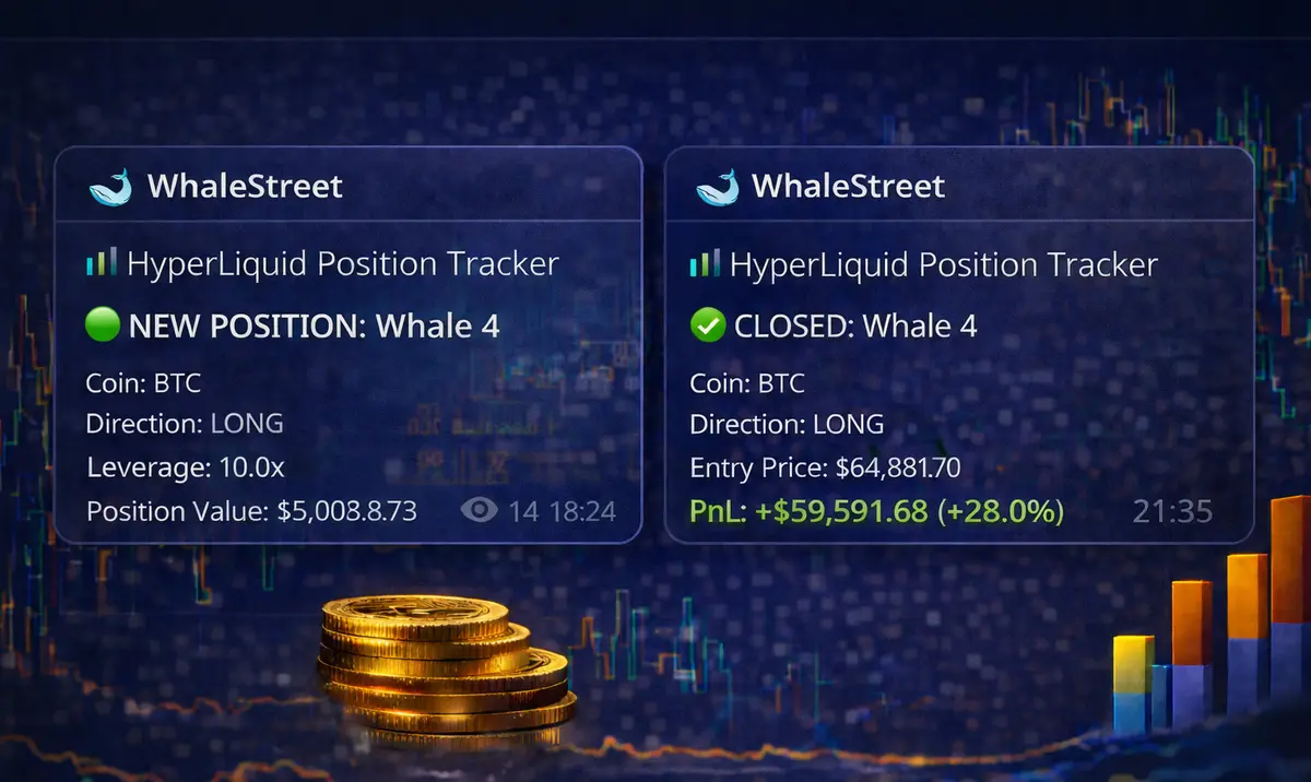
If you want to take Hyperliquid data one step further, WhaleStreet focuses specifically on tracking large wallets in real time.
Instead of manually searching for wallets, you get instant alerts when major traders open positions.
What you get:
- Real-time alerts when Hyperliquid whale wallets open trades
- Insight into large leveraged positions before the crowd reacts
- A clearer view of what “smart money” is doing in the market
Why it matters
Large wallets can move markets or anticipate big moves. By seeing these positions early, you can:
- Stay aware of potential volatility
- Understand where big capital is positioning
- Use it as an extra confirmation layer in your own strategy
Limitations: Whales open losing trades as well, and often we notice that the bigger wallets cut their losses more quickly and let their winners run.
Summary: WhaleStreet helps you track Hyperliquid whale activity in real time, turning transparent on-chain data into actionable alerts.
How to Combine Indicators
This is probably the most important part. Think of it like 1 + 1 = 3.
If you rely on a single indicator, you’re missing the bigger picture. The real edge comes from combining indicators so they complement each other and tell the same story.
Let’s look at a few examples:
Example 1: Confluence in Price Structure
Let’s say you spot an ascending triangle forming. This is generally a bullish pattern, as the horizontal resistance is more likely to break to the upside.
Now combine that with other data:
- Buying pressure is increasing on the heatmaps
- Liquidation heatmaps show a large cluster above the price
Now multiple indicators are pointing in the same direction:
Pressure is building, and a potential breakout to the upside is coming
This is where the edge comes from. Not the pattern alone, but the confluence of signals.
Example 2: Sector Rotation
Let’s say altcoins are gaining traction and the Altcoin Season Index is rising.
You want to trade alts, but which ones?
Instead of guessing, you refine your approach:
- Use the Crypto Sector Performance Index
- Identify which sectors are outperforming (e.g., Privacy, AI, ISO20022)
- Then focus only on coins within that sector
This way, you’re not just trading “altcoins”, you’re trading where the money is actually flowing.
Example 3: Smart Money + Confirmation
Another powerful way to use indicators is as a confirmation layer.
Let’s say you receive an alert from Hyperliquid whales via WhaleStreet:
A large wallet opens a short position.
Instead of blindly copying, you validate:
- Sentiment: euphoric
- Funding rates: highly positive (crowded longs)
- Premium index: positive (over-speculation)
Now you have an extra layer of confirmation that they are all telling a similar story. It will not offer any certainty, but still, you can increase your odds.
Common Mistakes
Probably the biggest mistake most traders make is putting too much trust in a single indicator.
They might use an indicator a few times, see good results, and start believing it will always work. But that’s not how markets operate. The word indicator already says it: it’s an indication, not a certainty.
No indicator works all the time.
Another common mistake is emotional decision-making. This is not directly about indicators, but it affects how they are used.
Traders often:
- Try to win back losses by doubling down
- Become greedy after a few winning trades
- Use too much leverage or too much capital
And then one losing trade wipes out a large part of their account.
Thinking Like the Casino
The best way to approach trading is to think like a casino.
Take roulette as an example. Many players think it’s a 50/50 game (red or black), but because of the green “0”, the casino always has a small edge.
That edge is tiny, but over time, it becomes powerful.
Why?
Because:
- The casino plays the long game
- The edge is applied consistently
- The system is designed around probabilities
In trading, the goal is not to be right on every single trade. What actually matters is having a small edge, a consistent system, and solid risk management. Once those pieces are in place, it becomes a numbers game. Over time, if you consistently cut your losses, let your winners run, and manage your capital properly, that small edge can compound into meaningful profitability.
The reality is simple: there is no magic indicator and no secret strategy. Trading is about having an edge and applying it consistently over time.
Conclusion
The best traders don’t rely on one indicator to tell them what to do. They look at the full picture: price structure, sentiment, liquidity, positioning, cycles, and where capital is flowing. Each indicator gives you one piece of the puzzle, but the real edge comes when multiple signals start telling the same story. That is when you stop guessing and start making decisions with more context, confidence, and discipline.
If you want to apply these indicators in real time, you can use WhalePortal PRO charts to combine funding rates, premium index, heatmaps, and sector performance in one view.
And if you want to see what large traders are doing before the market moves, learn how to track smart money on Hyperliquid or follow real-time whale alerts on WhaleStreet.
FAQ
What is the best indicator for crypto trading?
There is no single “best” indicator. The real edge comes from combining different types of indicators, such as trend (EMA), sentiment (funding rates), and liquidity (heatmaps), to build a complete view of the market.
Are indicators reliable on their own?
No. Most indicators are based on past data and can give false signals when used alone. They work best as confirmation tools, not as standalone strategies.
What is the difference between leading and lagging indicators?
Lagging indicators (like moving averages) confirm trends after they start, while leading indicators (like RSI) try to signal potential reversals earlier. Leading indicators are faster but less reliable.
How many indicators should I use?
You don’t need many. In most cases, 3–5 well-chosen indicators from different categories (trend, sentiment, liquidity) are more than enough. More indicators often lead to confusion, not clarity.
Can I copy trades from smart money or whale wallets?
You can track them, especially on platforms like Hyperliquid, but copying blindly is risky. Use wallet data as context and confirmation, not as a direct buy or sell signal.
Do indicators guarantee profitable trades?
No. Indicators don’t predict the future; they help you make better decisions. Profitability comes from having an edge, managing risk properly, and applying your strategy consistently over time.